Post Purchase experience for BNPL
I lead a design team that completely revamped the post purchase experience of a buy now pay later product. Drastically changed the ways of working by breaking team silos and encompassing the holistic user journey. We set out to be a sustainable driver of retention by cultivating a safe haven where users feel they have everything under control and at the same time drive awareness of extended features.
V I S I O N
Klarna is the only product I need to manage everything about all my purchases in one place.
Teams were building custom representations based on their individual needs, leading to an experience built to reflect the companies structure instead of the user’s journey.
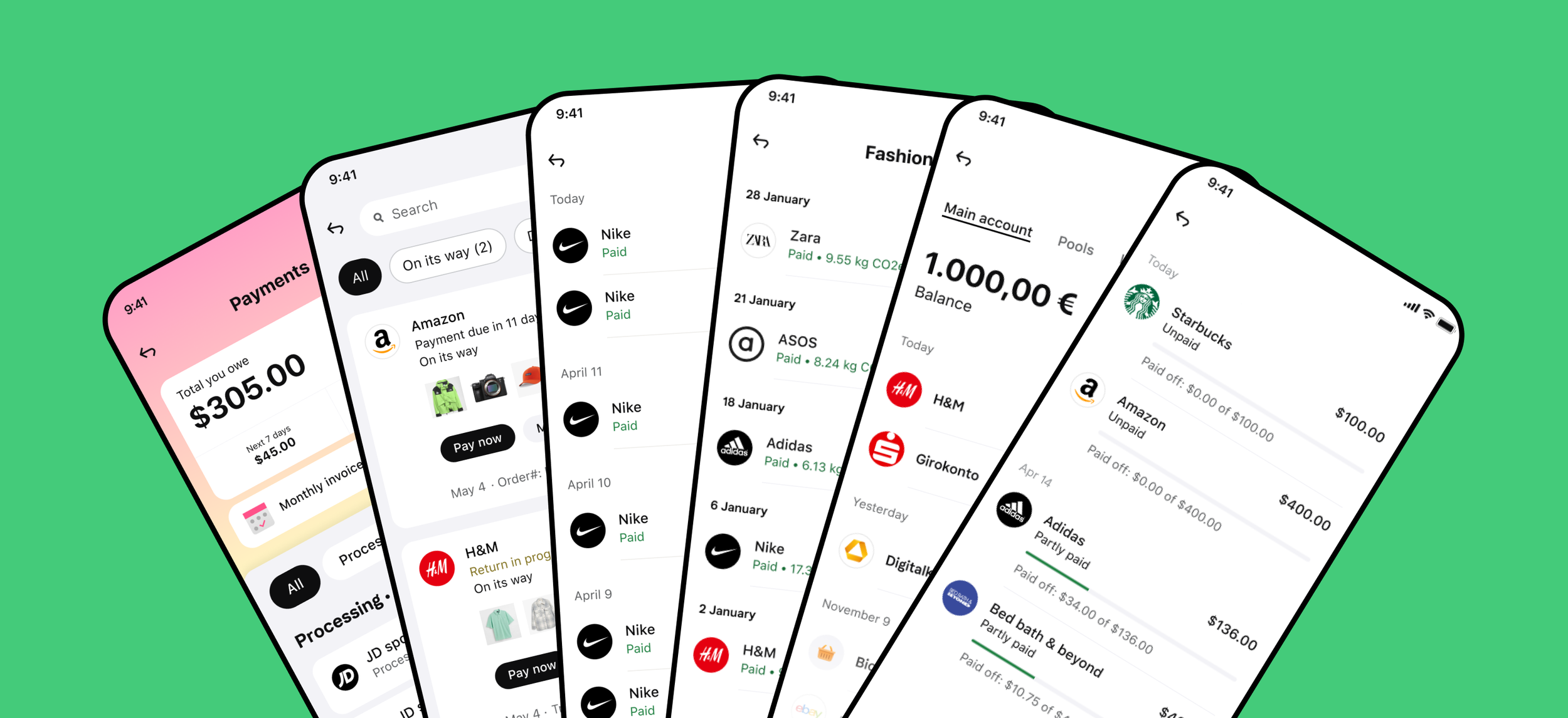
Transactions were represented differently based on the list they were part off.
Trasnaction detail pages were represented differently based on the financial product.
User problem to solve
Cognitive overload
Inconsistent patterns
Low feature discovery like reporting a return and delivery tracking
“I feel like I am using some kind of teenagers social media, there is SO much going on . It is difficult to simply locate what I need.”
“I only go to check on payments. I don’t understand the difference between the orders and payment list.”
“I'm needing help to return some items and the app is not friendly.”
Expereince principles
One system
Consistent patterns across all types of purchases and through out the post purchase funnel.
Contextual
The right information in the right moment.
Ah-ha! moments
Moments of delight that make the difference and instil trust in the service.

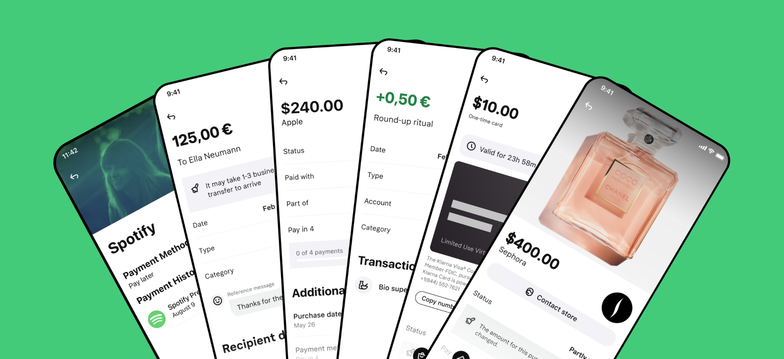
1) Create a single source of truth content system for statuses
Aligning status names was at the root of solving the problem. Together with engineering teams, we built a single source of truth data source that collected all states and details a transaction could have throughout the user journey.


2) Create a single list item component that all features can use
We built a scalable solution that enabled all transactions to be represented in the best way possible, taking into consideration their importance and their context.
3) Create a single page template that all financial products can use


Design for the journey, not for single pages.
Refelctions.
If your design is not based on a system the experience will fail.
Consistency goes beyond UI patterns.
Improving a product experience should also improve the ways of working that build it.